PCOSgirlies
Overview
003
Completed
2025
A soft place to land for women living with PCOS.
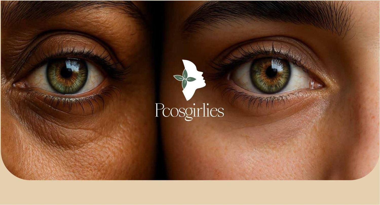
PCOSgirlies is a community and wellness platform for women living with PCOS and hormonal challenges. The founder wanted a safe, uplifting space, the opposite of the clinical tone most health brands in this area use.
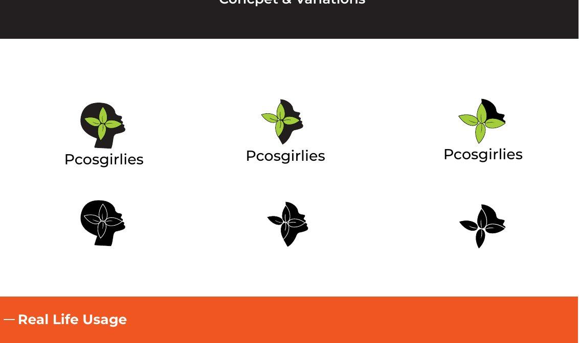
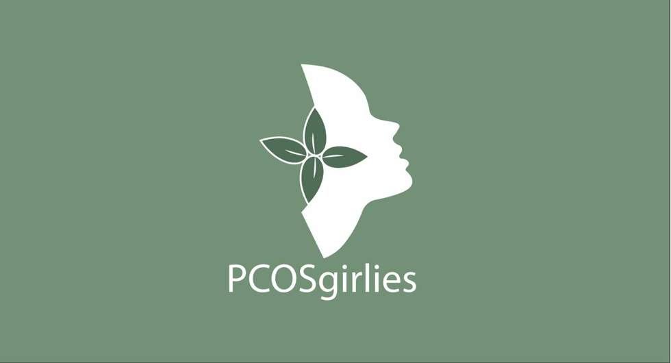
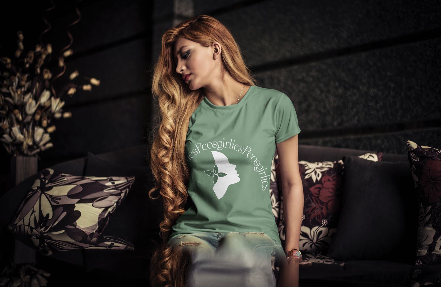
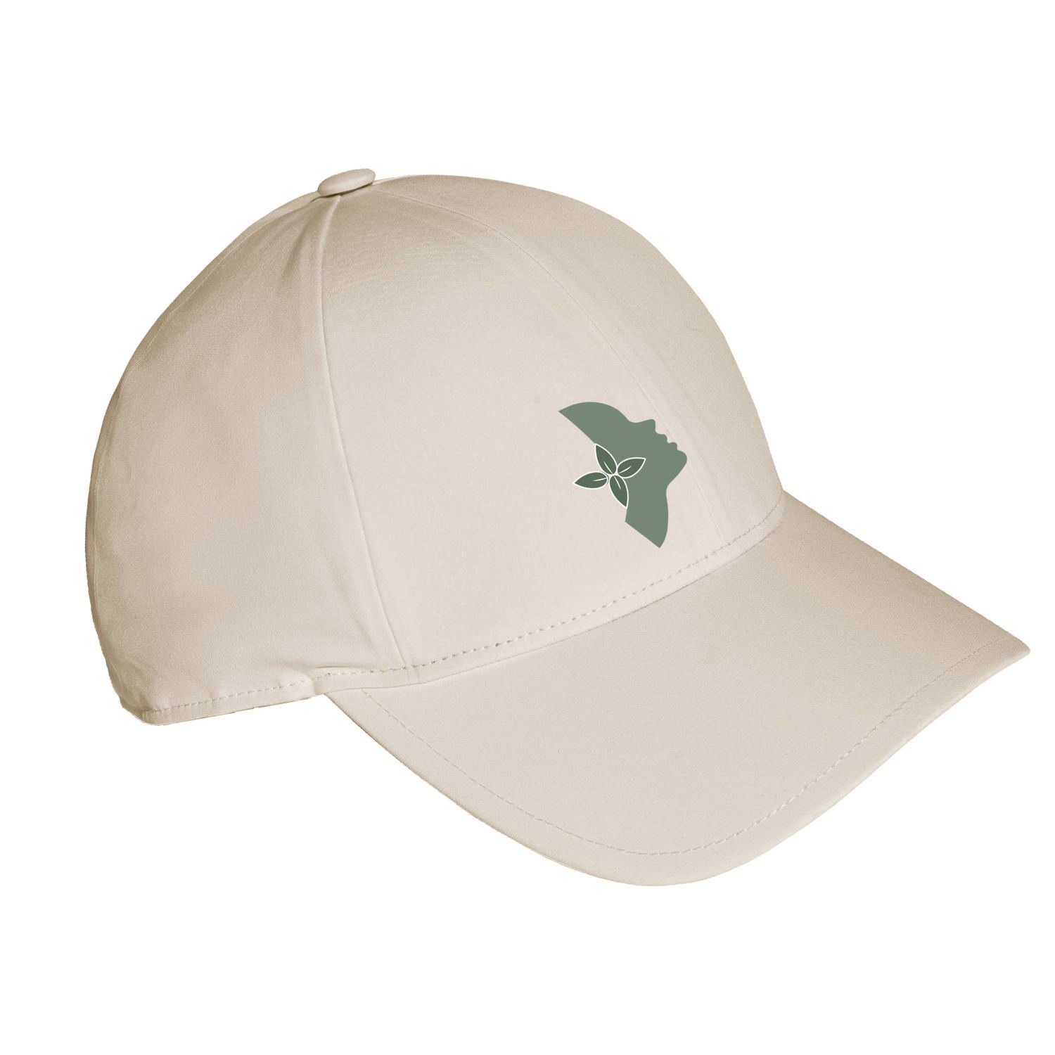
The mark is a woman's profile with a leaf and a bird rising from it. It says growth and release without any medical imagery.
Process
How it was made
and why
Before the work, the thinking.
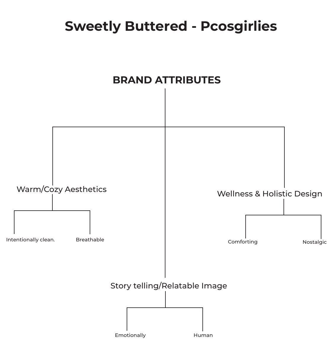
Before drawing anything, I mapped the brand: warm and cosy, wellness and holistic design, storytelling and relatable imagery.
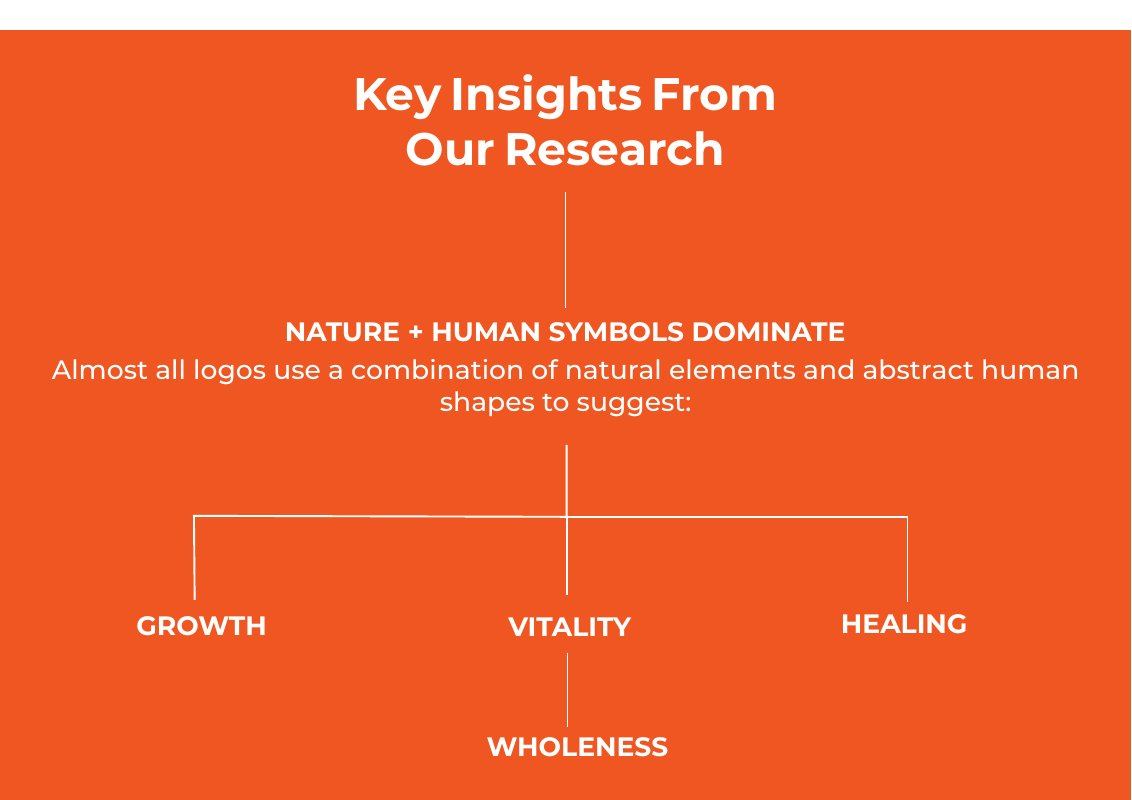
Research across holistic health centres, therapy practices, yoga studios and wellness start-ups showed one pattern. Almost every mark combines nature with the human form.
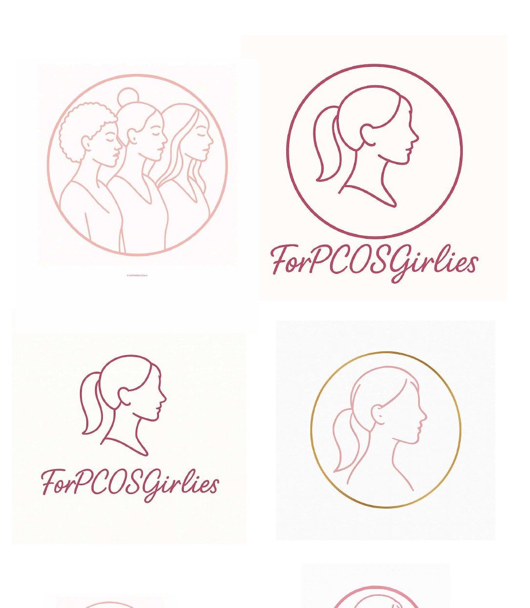
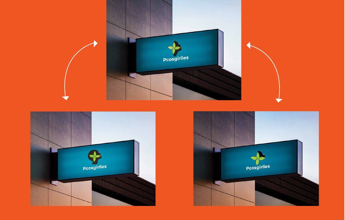
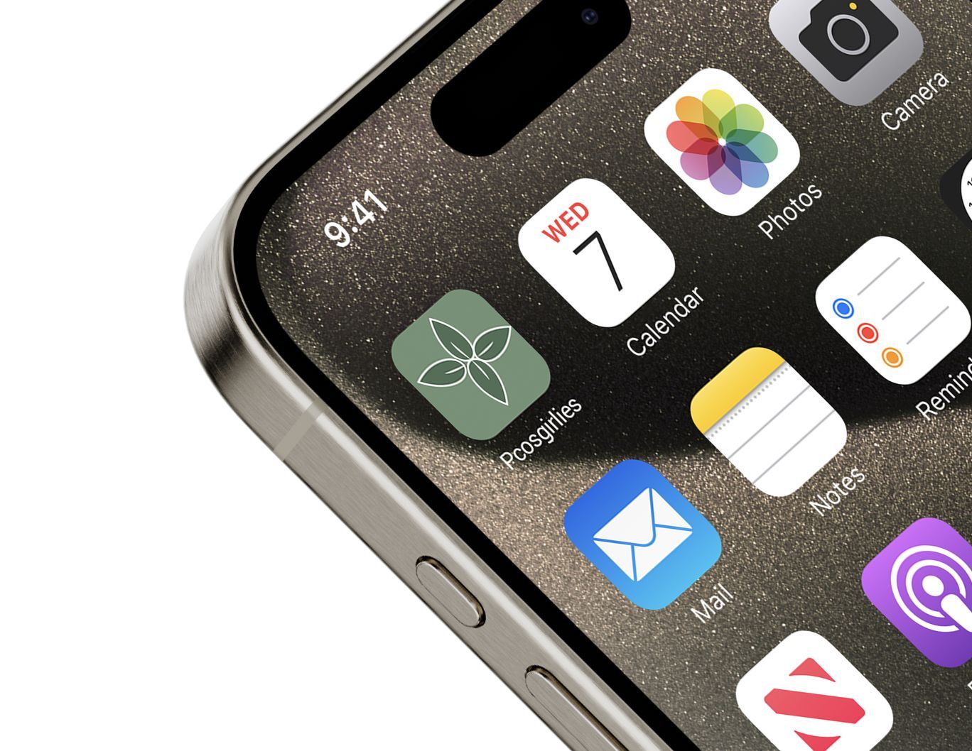
The founder's own logo was delicate but lacked warmth and broke down at small sizes. So I drew six leaf-and-profile concepts and tested them on signage and at app-icon size before choosing the final mark.
The feeling
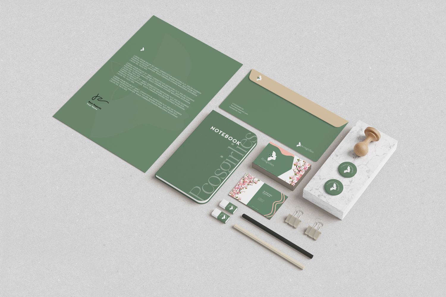
Most health brands in this space feel clinical. This one needed to feel like a sister: a profile, a three-leaf flower, sage for calm and a lot of space to breathe.
“Sisterly, supportive, real.”
Selected documentation
Visual study
Project record
Roles
- Creative Direction
- Brand Identity
- Brand Guidelines
- Website Design
Full project
See it in the portfolio PDF Next project / 004Sweetly Buttered